Review: Hollow 2 – A Sequel That Shoots Itself In The Foot
Sequels are supposed to be better than their predecessors. Although such a statement doesn’t always ring true (plenty will have a lot to say about which of the Metroid Prime games is their favourite) the intention behind a sequel is to learn from and improve upon previous works – that’s the theory, at least. When Hollow released on the Nintendo Switch in 2018 we didn’t like it all that much, calling it an “ugly game” that was “difficult to play”. Surely, then, its sequel will turn out to be a better experience..? Well, it’s different.
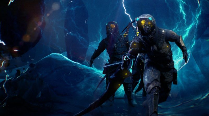
Although visually similar to the first game, Hollow 2 takes the same general setup and gameplay but dials the action right up to 11. It feels like a completely different game as a result; gone are the slow, explorative sections of the first title, replaced instead with almost constant horde-like showdowns with the various enemies, all of which come thick and fast right from the start. Like we said, it’s a different experience, but one that’s still plagued with the same agonising issues, making Hollow 2 an absolute chore to play.
First off the game looks as bad, if not worse, than its predecessor. With the action ramped up and more enemies filling up the screen, environmental details have taken a hit as a result; you’ll come across rooms and corridors that look almost identical to each other thanks to continual reuse of assets throughout the game. It’s such a repetitive experience that you’ll end up getting lost frequently due to the constant sense of déjà vu. To exacerbate this, there are needless visual distractions such as lens flare that fills the screen whenever you shoot your weapons, and a heavy camera filter that distorts and blurs the display to the point where the environment warps at the edges of the screen – it looks dreadful.
The enemy design is similarly lacklustre and doesn’t hold a candle to notable FPS titles like DOOM (2016) or Borderlands, even accounting for this game’s more humble origins. There are a small number of creature designs that – again – repeat frequently throughout the game. They’ve also been given a garish yellow tinge which we suspect is intended to ensure they stand out effectively against the dark background, but this also makes them about as scary and menacing as Bowser Jr trotting along Isle Delfino with a paintbrush. What’s more problematic, however, is that most of the creatures have a distinct female form and move towards you in an almost perverted sensual swagger, swinging their hips in an exaggerated fashion; it’s disturbing, to say the least, and likely not in a way that was intended.
All of this might have been forgiven if the gameplay proved its worth, but unfortunately this is perhaps Hollow 2’s greatest sin. Movement feels somehow both sluggish and skittish, making the simple act of aiming feel like a nightmare. Camera sensitivity can be adjusted in the settings, but we never found that sweet-spot to make the gameplay feel satisfying. Perhaps even more sinful – depending on your preferences – is the lack of any option to invert the Y-axis; a lot of players don’t mess around with this, which is fine, but at least give us the option. Those hoping for gyro controls will also be disappointed, as these aren’t present in any sense.
In terms of the weapons themselves, the main character starts off with a basic ‘pistol’ called the Pinner, before obtaining beefier weapons like the Ripper and Cutter later down the line. None of the weapons pack any kind of punch and they all feel like they’re just shooting out little paintball pellets. It’s the most bland FPS combat we’ve played in a good while and we feel the developer would have been wise to reign in the combat and put its focus on providing a more atmospheric experience.
Unfortunately, the storytelling is also pretty dire. As you move through the space vessel Shakhter-One a woman’s voice plays over the speakers, berating you, yelling at you, and generally just doing her utmost to distract you from the job at hand. Much like the first game, the writing is again hampered by the poor English translation, meaning half of the dialogue isn’t even remotely understandable, and even basic tasks require a second glance to fully comprehend. The developers even have the sheer audacity to reference the critical reception to the first Hollow, poking fun at critics who dared to give the game 2 out of 10. This joke would land better – heck, even be funny – had criticism been taken on board and delivered a better game this time around; that hasn’t happened.
It’s clear with Hollow 2 that a more visceral, DOOM-like approach was taken when compared to the first game. While we have to give the developer credit for at least trying something different, it ultimately fails to deliver a compelling experience with poor combat, boring weapons, awful enemy design, and repetitive environments. What’s more frustrating, though, is that there’s a good game buried somewhere beneath all the jank; there’s enough here to indicate that Megapixel Studio understands the fundamentals of the FPS genre; unfortunately its execution completely misses the mark.


